前言
公司有一个业务流程是需要步骤条的,为该业务新搭建了个h5的项目(v3+vite3.2+vant),h5页面直接嵌套在app端的,导航条是由app端控制的,第一个步骤是由app端完成,后面两步是由我们完成,步骤条等一切样式要求高度的统一,vant等ui库自带的步骤条组件,还需要自己一个个样式穿透的去改样式,得到的可能还不是自己想要的,于是就自己封装了一个,以便自己以后遇到同样的流程或业务,能够直接C+V。不多bbbb,直接上效果图和代码
一、vue3步骤条组件的封装
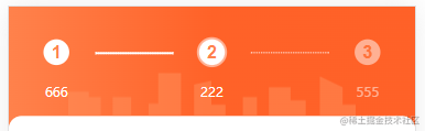
1.效果图
2.代码
其中$px2rem(‘72px’)是因为使用了移动端适配的插件postcss-pxtorem并做了相应的配置后,发现行内样式移动端适配的插件不生效。于是在main.ts里定义了一个全局行内的方法,让行内样式也能移动端适配
1
2
3
4
5
6
7
8
9
|
const px2rem = (px:any) => {
if(/%/ig.test(px)){
return px
}else{
return (parseFloat(px) / 37.5) + 'rem'
}
}
app.config.globalProperties.$px2rem = px2rem
|
1
2
3
4
5
6
7
8
9
10
11
12
13
14
15
16
17
18
19
20
21
22
23
24
25
26
27
28
29
30
31
32
33
34
35
36
37
38
39
40
41
42
43
44
45
46
47
48
49
50
51
52
53
54
55
56
57
58
59
60
61
62
63
64
65
66
67
68
69
70
71
72
73
74
75
76
77
78
79
80
81
82
83
84
85
86
87
88
89
90
91
92
93
94
95
96
97
98
99
100
101
102
103
104
105
106
107
108
109
110
111
112
113
114
115
116
117
118
119
120
121
122
123
124
125
126
127
128
129
130
131
132
133
134
135
136
137
138
139
140
141
142
143
144
145
146
147
148
149
150
151
152
153
| <template>
<!-- Steps 步骤条-组件 -->
<div class="formStep">
<div v-for="(item,index) in stepData" v-bind:key="index" class="stepContent">
<div
:class="((stepActive > index ?'stepItemSuccess stepItem':'stepItem'))"
>
<div class="stepShow">
<div :class="index == stepActive-1 ? 'currentStepIndex' :'stepIndex'">
<span>{{index+1}}</span>
</div>
<div class="stepStatus ">
<div class="stepName">{{item.status}}</div>
</div>
</div>
</div>
<div :class="stepActive-1 <= index? 'stepActiveLine': 'stepLine'" :style="{width:index == stepData.length-1 ? 0+'px' : $px2rem('72px'),border:index == stepData.length-1 ? 'none' : '1px dashed #FFFFFF'}">
</div>
</div>
</div>
<div class="bgCard">
<img src="@/assets/images/bgCard.png" :style="{width: $px2rem('265px'),height:$px2rem('40px')}"/>
</div>
</template>
<script setup lang="ts">
interface propsStep {
stepData: any,
stepActive: number
}
const props = withDefaults(defineProps<propsStep>(), {
stepData: [],
stepActive: 1
});
</script>
<style scoped lang="scss">
.formStep {
width: 100%;
background: linear-gradient(to right, #FE7E41, #FF5D0F, #FF5C0E);
// background-color: #FF5C0E;
display: flex;
justify-content: space-between;
padding-top: 30px;
padding-bottom: 24px;
.stepContent {
z-index: 999;
}
.stepLine {
height: 2px;
width: 100%;
background: #FFFFFF;
position: absolute;
top: 12px;
margin-left: 80px;
margin-top: 30px;
}
.stepActiveLine {
border: 1px dashed #FFFFFF;
position: absolute;
top: 12px;
margin-left: 80px;
margin-top: 30px;
}
.stepItem {
display: flex;
flex-direction:column;
.stepStatus {
display: flex;
justify-content: center;
align-items: center;
margin-top: 16px;
}
.stepName {
height: 17px;
font-size: 12px;
font-family: PingFangSC-Medium, PingFang SC;
font-weight: 500;
color: #FFFFFF;
line-height: 17px;
opacity: 50%;
}
.stepIndex {
width: 24px;
height: 24px;
text-align: center;
font-size: 16px;
font-weight: bold;
color: #FE7E41;
background: #FFFFFF;
border-radius: 50%;
opacity: 50%;
display: flex;
justify-content: center;
align-items: center;
margin-left: 32px;
margin-right: 32px;
}
.currentStepIndex {
width: 24px;
height: 24px;
text-align: center;
font-size: 16px;
font-weight: bold;
color: #FE7E41;
background: #FFFFFF;
border-radius: 50%;
border: 3px #e8e8e8;
display: flex;
justify-content: center;
align-items: center;
box-shadow: 0 0 0 2px rgb(255 255 255 / 50%);
margin-left: 32px;
margin-right: 32px;
}
}
}
.bgCard {
width: 100%;
display: flex;
justify-content: center;
align-items: center;
margin-top: -50px;
}
.formStep .stepItemSuccess.stepItem .stepName {
opacity: 100%;
}
.formStep .stepItemSuccess.stepItem .stepIndex {
color: #FE7E41;
opacity: 100%;
}
.formStep .stepItemActive.stepItem .stepName {
opacity: 50%;
}
.formStep .stepItemActive.stepItem .stepIndex {
color: #FE7E41;
opacity: 50%;
}
</style>
|
3.使用
在需要这个用到的组件那块导入
import stepBar from ‘@/components/stepBar/stepBar.vue’
1
2
3
4
5
6
7
8
9
10
11
12
13
14
15
16
17
|
<step-bar :stepData="stepData" :stepActive="stepActive"/>
<script lang="ts" setup>
const stepActive = ref(2)
const stepData = ref([
{
status: "666"
},
{
status: "222"
},
{
status: "555"
}
])
<script/>
|
Props 参数说明
| 参数名 | 类型 | 默认值 | 说明 |
|---|
| stepData | Array | [] | 步骤内容(如上面的‘666’‘222’什么的) |
| stepActive | Number | 0 | 代表进行到了第几步 |